Posts

5 Reasons Why Your Company Needs a Professional Website

It’s 2018. People spend almost over 10 hours a day in front of screen, but some businesses still don’t have their own websites. With social media, some organizations may not think it’s necessary to have their own websites, but that’s simply not the case. Having a website gives your business a leg up on the competition, even if the competition already has a website. Read on to find out the top five reasons your organization should invest in a professional website today.

man working on a website

1. It’s a platform you own and control.
It’s great to be on social media, but when algorithms change (I’m looking at you Instagram) it can be frustrating. When you have your own website, you get to control exactly what information is out there, and when and how that information is displayed to users. When you have your own website, you’re not subject to anyone’s control — you make all the decisions. You can also make it as unique or standard as you’d like. The greatest thing about having your own website is that it’s YOURS.

2. Grow your audience.
Having a website means you aren’t limited in who you reach. It’s the World-Wide Web for a reason. Even if you’ve only got one brick-and-mortar shop, you can reach hundreds of people who never would have otherwise known that your business existed. Having a website also provides your business with another platform to sell goods or services. In a world that can feel large and distant sometimes, a website can connect your business with all the corners of the globe.

3. Gives your business credibility.
People are increasingly turning to the Internet for answers to their questions. This is even more true for people that own smart-speakers like Google Home or Alexa. When someone searches for “the best pie in Nashville,” you want your website to show up. You might not be on the first page at the beginning, but with a professionally designed website and a digital marketing firm on your team, you’re website is sure to rise in the rankings.

4. Easily provide information.
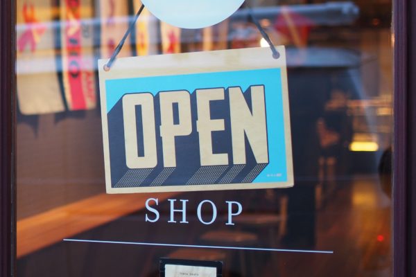
Websites are increasingly important to get information out quickly to all consumers. Yes, you can put this information on social media, but your website is a one-stop-shop for all the information any consumer may need about your business. Not everyone may be on social media, but almost everyone can find a website if they have an Internet connection, which should answer any questions they may have. This is helpful when your store hours change, when you’re having a sale, or when there is a community event happening. Having a website truly makes it easier to communicate with your mass audience of consumers. And you can control whatever information gets out there and how long it is available.

5. Save money in the long run.
Traditional marketing is still important in the digital age, but when developing a website and social media presence, organizations can cut down on traditional marketing costs. It might cost an initial start-up fee to design and deploy a professional website, but having a website makes it easier in the long run to promote and advertise.

Are you looking to build a professional website? Contact Cabedge today! With a team of experienced web developers and web designers, we can create exactly the website your business needs to get on the map.

typography

7 Tips to Making the Most of Your Typography

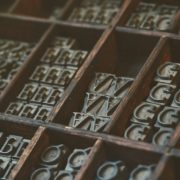
Typography can make or break your design. The difference between Arial and Verdana may not seem that important, but at the end of the day, readability, adaptability, and functionality are crucial when it comes to the fonts you choose. Fonts can serve as an extension of your brand personality and elevate your website design to the next level. Check out the 7 tips we have for making the most of the typography in your website design.

1. Minimize the amount of fonts you use.
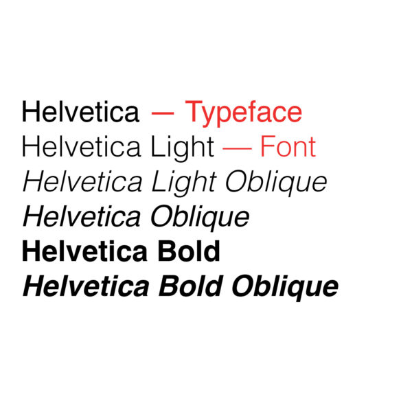
Typically you should limit yourself to 1-3 fonts. If you use any more than that, it starts to look muddled and messy. A pro tip for using more than one font is to use the various fonts in a typeface. A typeface is the kind of typography you are using. A font is the different forms that typeface comes in. For example, Helvetica is a popular typeface. When you make it bold, thin, or italic, you’re using a specific font. It brings dynamic design to your website, without making it feel crowded with too many fonts.

2. Use complimentary fonts.
When you use more than one font, it’s important to pair complementary fonts. Typically, serif and sans-serifs look good together and san-serifs and scripts mix well (as pictured above). When pairing fonts, they should be from different families. Pairing a serif and a serif doesn’t provide enough contrast to make the design look intentional.

3. Choose an easy to read font at any size.
It’s important that the fonts you choose can be read at small and large sizes. Because you might also want to use these fonts on print collateral, you’ve got to make sure they transfer. There’s no guarantee that people will be reading your website in the font size you designed it in — with the power of the digital age, people can adjust the size of the screen to their preferences, therefore you’ve got to make sure the fonts are legible no matter what they are resized to.

4. USE ALL CAPS SPARINGLY.
All caps can be a great stylistic choice (as seen above for Fifty Licks Ice Cream), but only in small doses. All caps can be effective for headlines or labels, but putting an entire paragraph in all caps can make it difficult to read for users.

5. Use text as a design element.
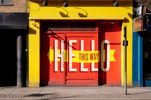
Text can be used to indicate hierarchy throughout the page, it can direct a users attention to specific areas of the page, it can indicate how someone should feel about something. Text can do a lot of things. That’s why it’s important to pick the right text to convey your message across your website. For example, in the image above, the typography is the main design element. Pairing a large text with a smaller text shows hierarchy and situating certain text over the rest of the text makes the message pop. It’s simple yet effective.

6. Don’t just accept the tracking and kerning. Feel free to change it!
Tracking is the space between an entire set of letters/numbers. Kerning is the space between a pair of letters/numbers. Changing the kerning or tracking can transform the display of text. This is more acceptable in header or display text. We don’t recommend playing around with the kerning/tracking of a body of text, it’s too much work. But if you’re working on typography for a logo or header of a website, it’s worth the time to adjust the tracking or kerning or that display text.

7. DO NOT STRETCH A TYPEFACE.
You should never try to manipulate the size or shape of a font. By “manipulating” we mean stretching or shrinking. You can change a font size or switch between bold or thin faces, but when you manually stretch a font, or manipulate a font, you are changing the structure the designer intended for the font. Not only does it make a font look odd, but it compromises the designers original intent.

If you need help choosing typefaces for your website design, reach out to Cabedge. We have a team of designers that are ready to help with your web design needs.


How Gestalt Principles Can Be Incorporated in Web Design

Gestalt psychology stems from German psychologists and scientists of the 1920s who believed that the mind worked subconsciously to make sense of an otherwise chaotic world. There are many principles of grouping in Gestalt psychology that have been used to explain how the mind perceives images, and some of the most prominent principles can be applied to design techniques used regularly in print and web design. Today, we are going to go over seven Gestalt principles that can help improve design.

Law of Proximity
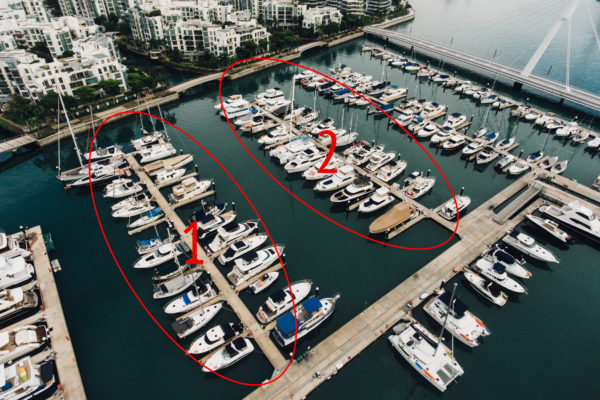
The Law of Proximity states that people group elements together that are close to each other in space. This can be seen in the header or footer space of a website — all of those elements are close together in proximity either in a line or under certain headings, which lets users know they are to be perceived as one unit. You can also see the Law of Proximity exemplified in the example photo above. The boats are clumped together in sets of columns. When looking at the picture, people automatically associate the four columns of boats as two groups.

Law of Similarity
The Law of Similarity states that people group similar elements together. Whether it’s shape, size, color, or texture, these characteristics can lead to people grouping things together in their minds. It’s like looking at a pizza with a handful of toppings and grouping the mushrooms together, the pepperoni together, and the pineapple chunks together. In the image above, people will tend to group the windows together based on the color swatch in the top bar. Therefore, the windows would be grouped by the Law of Similarity in the following groups: yellow, pink, blue, light blue.

Law of Closure
If images aren’t closed, our minds can and will close them for us. For instance, when parts of an image are missing, like a flower petal is out of frame, people still know the image is a flower and can imagine the other petal. With the Law of Closure, people can combine disjointed lines into complete shapes. This is a good design principle to keep in mind when designing logos or website backgrounds. The Law of Closure can be seen in action in the image above because people that look at the image of the moon can instinctively close the shape to imagine the moon whole.

Law of Symmetry
The mind likes symmetry, which we talked about in an earlier blog post dedicated to basic design principles. The Law of Symmetry operates under that notion. It is pleasing to the mind to be able to divide objects into an even number of symmetrical parts. People tend to look for symmetry in design or images even if it may not truly be there. In the above image, the symmetry is pretty apparent in the even space between the windows and the square shape of the windows themselves.

Law of Common Fate
The Law of Common Fate claims that if there is movement, real or digitally constructed, in an image or design, people tend to group similar movements together. People tend to group elements that move in the same direction together. For instance, in the image above of cars moving on the highway, people infer that the white stream and the red stream are moving in opposite directions.

Law of Pragnanz (or Good Figure)
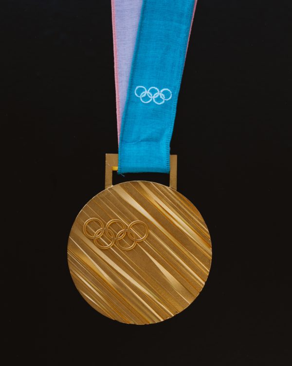
The Law of Pragnanz states that people tend to perceive images as a whole rather than breaking them up into their individual parts. It’s like seeing the steps of how someone draws a cat. Technically, the head could be a circle, the nose could be an upside-down heart, and the ears could be triangles. The Law of Pragnanz at plays means that cat is perceived as a cat rather than the individual elements. We perceive things in the simplest way possible. This can also be seen when looking at the Olympic rings  — people tend to perceive it simply as the logo and not as five separate circles.

Law of Figure/Ground
Disliking uncertainty, people tend to look for solid, stable items in an image or design first. People tend to see the foreground of an image before they see the background. For example, in the above image, a viewer’s eye would be first drawn to the leaves and then to the ground they are strewn upon.

There are many other Gestalt principles that can be applied to design, but these are a good place to start. If you’re looking for more design tips or inspiration, make sure to follow along on the Cabedge blog. If you’re looking for assistance in designing a website, reach out to Cabedge today for a personal consultation.

cabedge blog post

Web Design Principles for the Modern Age

Design principles are always changing, meaning web design principles are changing even faster. Here are the top five trends Cabedge is anticipating for website design in 2018:

Broken Grid Layouts
If you’re not a designer, you probably don’t know about the grid method of design. Basically, you use a grid to lay out all the elements on a page (web or print). Using the grid, you can determine the appropriate amount of space between elements, height of text, size of photos, etc. Going into 2018, designers are going to be breaking the grid to create more white space on the page and interest for the reader. With a broken grid layout, elements overlap and intersect at unexpected points leaving the user pleasantly surprised by the organic feel and appearance of the website.

The Rise of Brutalism
Minimalism has been living in the foreground of the design world for quite some time now. Designs that incorporate minimalist features are clean, utilize plenty of white space, and have key elements that are repeated throughout a website. Going into 2018, designers are seeing the emergence of a very different styles of design that has nothing to do with minimalism — brutalism. Brutalism is most easily described as throwing everything you know about design principles out the window. It’s a movement that says goodbye to design frills and focuses on bringing the user information in whatever manner necessary. Brutalism originates from design in architecture in a post-World War II world. The architecture was raw and free of frills in a world that needed to rebuild quickly, and that is what the web design movement is trying to achieve.

Large, Bold Design Elements
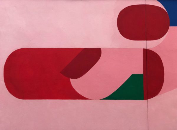
Minimalism is falling to the wayside as maximalist design is on the rise. Maximalist design utilizes bold colors and designs to draw the reader’s attention to the screen. Sometimes it can be overwhelming, but that’s kind of the idea. Along with maximalist design, bold design elements like large oblique and organic shapes are becoming common elements on web pages as design evolves from a minimalist to maximalist approach.

User Interaction
2018 is all about clicking, scrolling, and shifting — essentially, websites want to catch user’s attention by engaging and interacting with them in big and small ways. Web designers are focusing on getting the user to stay on the page with small things like a Parallax effect on background photos and page transitions to engage the user, even when engagement isn’t 100 percent necessary (like you don’t need them to click on the button). Designers are also trying to engage users in a more direct manner by including elements like videos for user to click on to play and watch. Social media is also capitalizing on this element of website design by increasing users options to interact with their friends’ posts. (think of Facebook’s addition of emotions like “love,” “haha” and “sad” to the “like” button).

Video as a Key Element
The auto-play element that Facebook has incorporated on its platform is beneficial for multiple reasons — it grabs a scroller’s attention and gets them to stop and watch something (at least for a few seconds), it increases the video’s view count, and it increases engagement on a website.

Ultimately, adding videos to a page’s design elevates the look and feel of the website while also improving SEO rankings.

Bold Fonts
Thin fonts have been covering our screens for years, but bold fonts are ready to take center stage. Fonts have the power to make or break a brand and a design. It’s important that it’s legible, eye-catching, and stands out among the crowd. There are millions of fonts to choose from these days, and designers are going for bold in 2018. Fonts can be used as the only element on the page for a clean, minimalist design look, or they can be mixed and matched to reach a brutalist design. The choice is yours, but we suggest you choose bold. Also, keep your eye out for serif fonts as they grow in popularity. You can never go wrong with a classic.

If you’re looking to update your website for the new year, contact Cabedge today! With years of experience in web design and a knowledge of all the latest trends, Cabedge is the perfect company to help you accomplish your web design goals.