7 Tips to Making the Most of Your Typography
Typography can make or break your design. The difference between Arial and Verdana may not seem that important, but at the end of the day, readability, adaptability, and functionality are crucial when it comes to the fonts you choose. Fonts can serve as an extension of your brand personality and elevate your website design to the next level. Check out the 7 tips we have for making the most of the typography in your website design.
1. Minimize the amount of fonts you use.
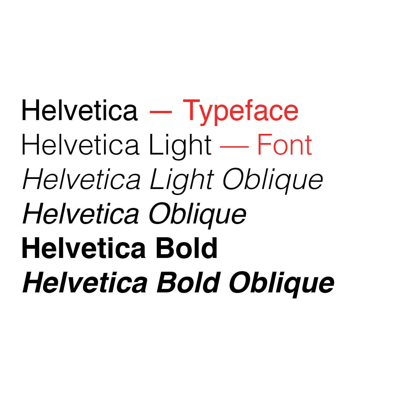
Typically you should limit yourself to 1-3 fonts. If you use any more than that, it starts to look muddled and messy. A pro tip for using more than one font is to use the various fonts in a typeface. A typeface is the kind of typography you are using. A font is the different forms that typeface comes in. For example, Helvetica is a popular typeface. When you make it bold, thin, or italic, you’re using a specific font. It brings dynamic design to your website, without making it feel crowded with too many fonts.

2. Use complimentary fonts.
When you use more than one font, it’s important to pair complementary fonts. Typically, serif and sans-serifs look good together and san-serifs and scripts mix well (as pictured above). When pairing fonts, they should be from different families. Pairing a serif and a serif doesn’t provide enough contrast to make the design look intentional.
3. Choose an easy to read font at any size.
It’s important that the fonts you choose can be read at small and large sizes. Because you might also want to use these fonts on print collateral, you’ve got to make sure they transfer. There’s no guarantee that people will be reading your website in the font size you designed it in — with the power of the digital age, people can adjust the size of the screen to their preferences, therefore you’ve got to make sure the fonts are legible no matter what they are resized to.
4. USE ALL CAPS SPARINGLY.
All caps can be a great stylistic choice (as seen above for Fifty Licks Ice Cream), but only in small doses. All caps can be effective for headlines or labels, but putting an entire paragraph in all caps can make it difficult to read for users.
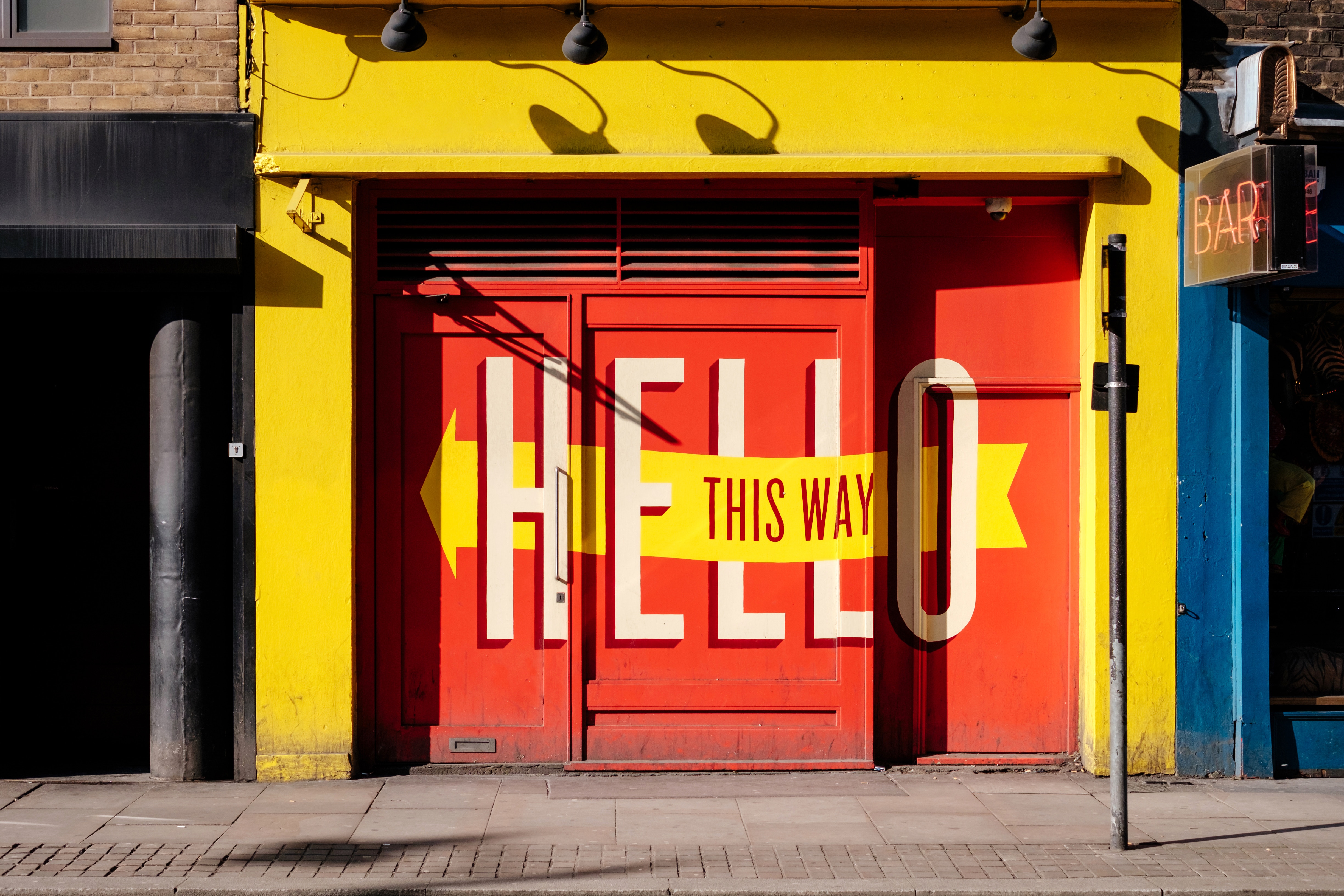
5. Use text as a design element.
Text can be used to indicate hierarchy throughout the page, it can direct a users attention to specific areas of the page, it can indicate how someone should feel about something. Text can do a lot of things. That’s why it’s important to pick the right text to convey your message across your website. For example, in the image above, the typography is the main design element. Pairing a large text with a smaller text shows hierarchy and situating certain text over the rest of the text makes the message pop. It’s simple yet effective.
6. Don’t just accept the tracking and kerning. Feel free to change it!
Tracking is the space between an entire set of letters/numbers. Kerning is the space between a pair of letters/numbers. Changing the kerning or tracking can transform the display of text. This is more acceptable in header or display text. We don’t recommend playing around with the kerning/tracking of a body of text, it’s too much work. But if you’re working on typography for a logo or header of a website, it’s worth the time to adjust the tracking or kerning or that display text.
7. DO NOT STRETCH A TYPEFACE.
You should never try to manipulate the size or shape of a font. By “manipulating” we mean stretching or shrinking. You can change a font size or switch between bold or thin faces, but when you manually stretch a font, or manipulate a font, you are changing the structure the designer intended for the font. Not only does it make a font look odd, but it compromises the designers original intent.
If you need help choosing typefaces for your website design, reach out to Cabedge. We have a team of designers that are ready to help with your web design needs.