Posts

Timeless Design Principles for Print and Web

Like many things in life, design techniques are always changing. While it’s important to keep up with trends, there are also classic principles that can make any website or print collateral design look clean and engaging. At Cabedge, we are concerned with creating useful designs for our clients. We know that you’re not just looking for a pretty website or beautiful print collateral — you want something that is going to work for your organization for years to come. We’ve got five timeless design principles you can utilize in your print collateral and website design today.


Visual Hierarchy

Otherwise known as “emphasis,” visual hierarchy gives your design structure to a viewer or user. It tells someone where they should first direct their attention and can be created through size, color, or position. For instance, if you look at the image above of the Krispy Kreme box, you can see that the brand name (Krispy Kreme) stands out visually because of the color, size, and font choice from the word “doughnuts,” which matches the green dots.The box also stands out from the background because the woman holding it is blurred, making the box more visually dominant. Those are two forms of visual hierarchy.  If you don’t know how to create visual hierarchy in your design, start by highlighting your business objectives and figuring out how to make those stand out in your designs amongst the other information.
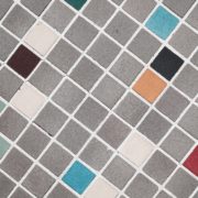
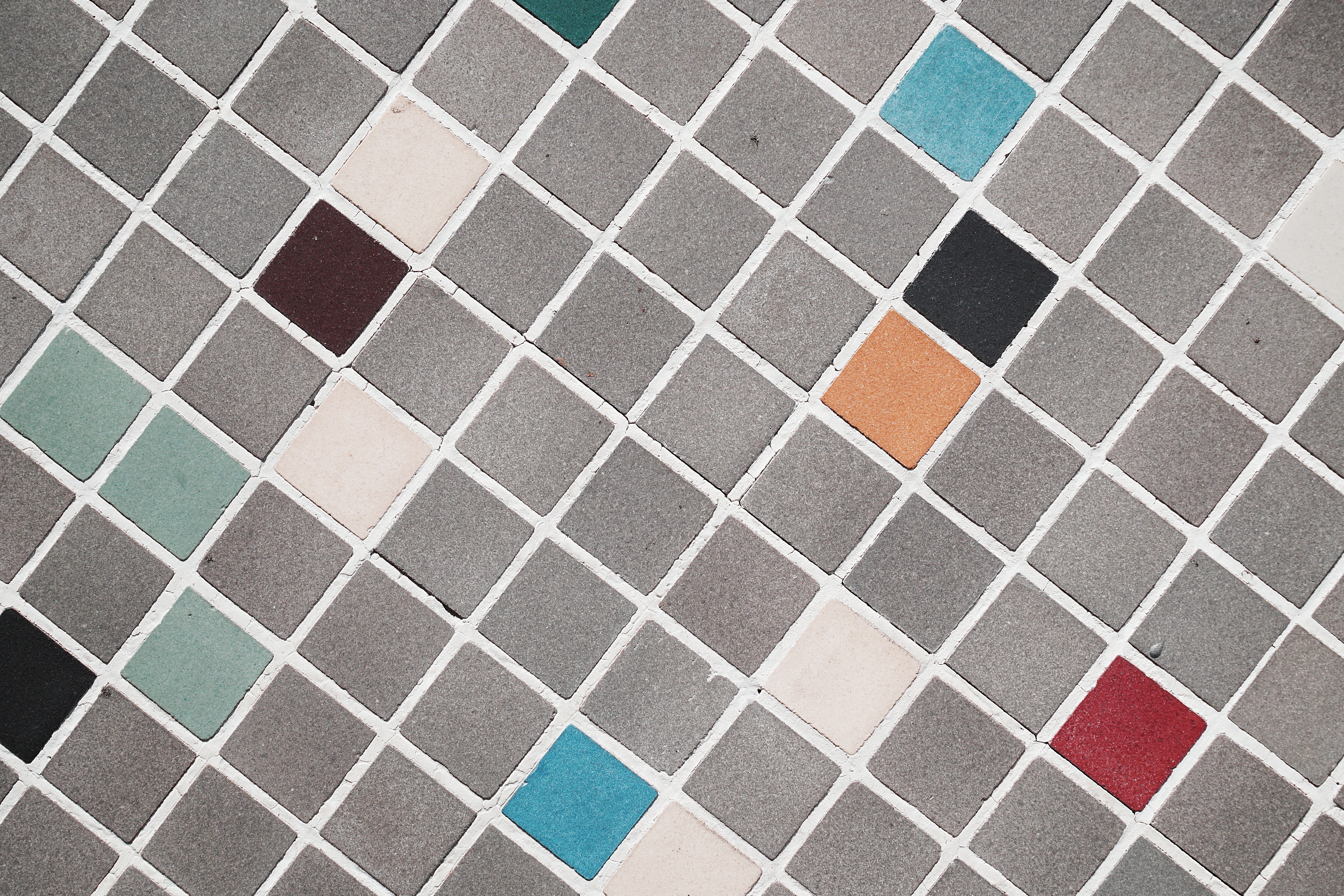
Balance

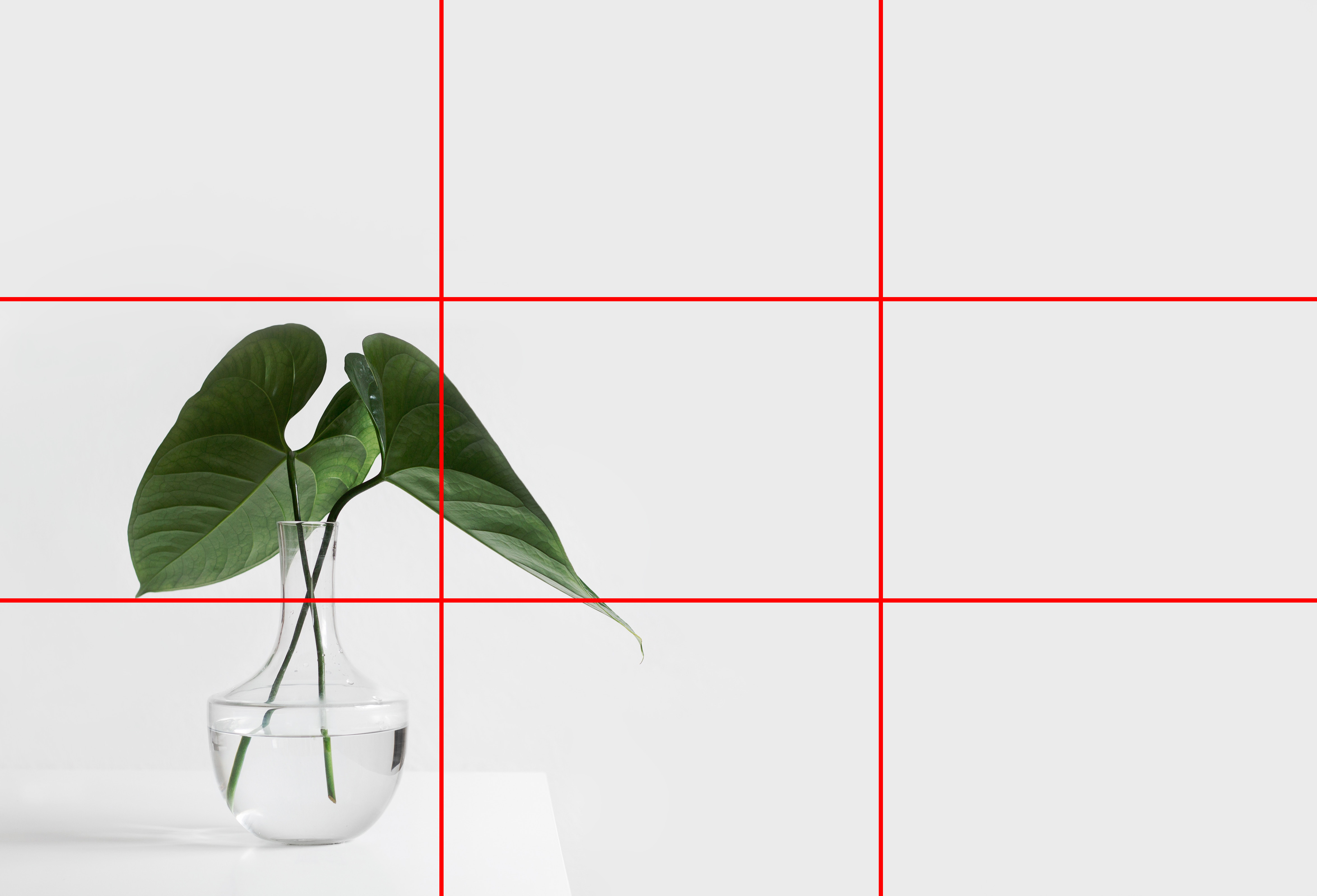
Balance refers to the visual distribution of weight in a design. Balance can be symmetrical, or it can be asymmetrical. Whichever choice you make, there should be an intent behind it. If you’re looking to achieve asymmetrical balance, start with the rule of thirds. This is typically applied to photographs (can be seen above), but can also be useful for web or print design when selecting a website layout. The rule of thirds states that an image should be divided into nine equal parts by two equally-spaced horizontal lines and two equally spaced vertical lines. The important elements should be placed along these lines or at their intersections. Symmetrical balance is exactly what it sounds like — if you can fold it in half and it’s the same on both sides, you’ve achieved symmetrical balance.

Utilize White Space

White space is a design element. It is not just blank space. White space is the simplest design principle you can utilize since it requires no extra work, just an ability to utilize the space given to you. White space also aids in the creation of hierarchy, a principle we discussed earlier. While design concepts like brutalism may be trending now, clean is classic and withstands the test of time. White space serves as a simple contrast tool against other elements on the page. It creates balance and ensures the design doesn’t get too overwhelming for users.

Repetition

People are drawn to pattern and repeating elements. Some of the more famous pieces of artwork utilize this principle of design as well (think Andy Warhol). Repetition is one of the simpler design principles to utilize in print and digital pieces since it requires utilizing elements that have already been created. On a website, repetition can extend to the user experience with similarly designed pages. That makes the experience seamless for the user and aids in unity, which we will talk about next.

Unity

Arguably the most important element of design is unity. It is also the hardest to achieve. Whether it is a piece of art, a website, or a book cover, every element should relate to another ensuring that the design as a whole feels like one piece of work. Unity is hard to describe, but when you see it, you know it.

If you’re looking to create timeless, useful designs for your organization (print or online), contact Cabedge. We love working with clients that want to create streamlined design experiences for their clients. You’ll be contacted by a design specialist to find out your organization’s needs, and we’ll work with you every step of the way to make sure you’re getting what you need.

cabedge blog

How Responsive Design Can Improve Your SEO

SEO is hugely important when it comes to showing up in search queries and having Google rank your website higher in its search results. One of the most important ways to boost SEO rankings in 2018 is through responsive design for your website. Let’s break down what SEO is and how responsive design can improve it.

SEO = Search Engine Optimization. Essentially, SEO involves getting your website to appear higher up in the search rankings for websites like Google and Bing. There’s tons to SEO, and you can learn more from websites like Moz or read more about it on the Cabedge blog.

Responsive design is only one of the tactics you can use to improve your SEO. Having a responsive design means your website will function smoothly no matter what device you are using to access it. You can easily use your website on a desktop, cell phone or tablet without compromising the user-friendly features or changing the functionality.

As devices other than desktops are increasingly being used to access data and information online, responsive design is becoming more and more important for SEO. Google is also set to launch its mobile-first index sometime in 2018, meaning that Google is going to start ranking websites based on their mobile friendliness. If you want to stay up to date on strategies to increase your SEO, responsive design is a great place to start.

Having a responsive design implemented for your website also means that you’ve increased the number of consumers you can reach without having to create an entirely different platform, like a downloadable application. Responsive design isn’t always the easiest thing to achieve, but all the hard work on the front-end will mean better results and less work in the long run for your company to maintain your website and boost your SEO.

If you’re organization is looking to create a website that utilizes responsive design, look not further than Cabedge. With years of experience in website design, back-end coding and SEO management, Cabedge is your one-stop shop for your website development needs. Reach out to us today, and we’ll get started on your personalized plan and design.

cabedge blog post

Web Design Principles for the Modern Age

Design principles are always changing, meaning web design principles are changing even faster. Here are the top five trends Cabedge is anticipating for website design in 2018:

Broken Grid Layouts
If you’re not a designer, you probably don’t know about the grid method of design. Basically, you use a grid to lay out all the elements on a page (web or print). Using the grid, you can determine the appropriate amount of space between elements, height of text, size of photos, etc. Going into 2018, designers are going to be breaking the grid to create more white space on the page and interest for the reader. With a broken grid layout, elements overlap and intersect at unexpected points leaving the user pleasantly surprised by the organic feel and appearance of the website.

The Rise of Brutalism
Minimalism has been living in the foreground of the design world for quite some time now. Designs that incorporate minimalist features are clean, utilize plenty of white space, and have key elements that are repeated throughout a website. Going into 2018, designers are seeing the emergence of a very different styles of design that has nothing to do with minimalism — brutalism. Brutalism is most easily described as throwing everything you know about design principles out the window. It’s a movement that says goodbye to design frills and focuses on bringing the user information in whatever manner necessary. Brutalism originates from design in architecture in a post-World War II world. The architecture was raw and free of frills in a world that needed to rebuild quickly, and that is what the web design movement is trying to achieve.

Large, Bold Design Elements
Minimalism is falling to the wayside as maximalist design is on the rise. Maximalist design utilizes bold colors and designs to draw the reader’s attention to the screen. Sometimes it can be overwhelming, but that’s kind of the idea. Along with maximalist design, bold design elements like large oblique and organic shapes are becoming common elements on web pages as design evolves from a minimalist to maximalist approach.

User Interaction
2018 is all about clicking, scrolling, and shifting — essentially, websites want to catch user’s attention by engaging and interacting with them in big and small ways. Web designers are focusing on getting the user to stay on the page with small things like a Parallax effect on background photos and page transitions to engage the user, even when engagement isn’t 100 percent necessary (like you don’t need them to click on the button). Designers are also trying to engage users in a more direct manner by including elements like videos for user to click on to play and watch. Social media is also capitalizing on this element of website design by increasing users options to interact with their friends’ posts. (think of Facebook’s addition of emotions like “love,” “haha” and “sad” to the “like” button).

Video as a Key Element
The auto-play element that Facebook has incorporated on its platform is beneficial for multiple reasons — it grabs a scroller’s attention and gets them to stop and watch something (at least for a few seconds), it increases the video’s view count, and it increases engagement on a website.

Ultimately, adding videos to a page’s design elevates the look and feel of the website while also improving SEO rankings.

Bold Fonts
Thin fonts have been covering our screens for years, but bold fonts are ready to take center stage. Fonts have the power to make or break a brand and a design. It’s important that it’s legible, eye-catching, and stands out among the crowd. There are millions of fonts to choose from these days, and designers are going for bold in 2018. Fonts can be used as the only element on the page for a clean, minimalist design look, or they can be mixed and matched to reach a brutalist design. The choice is yours, but we suggest you choose bold. Also, keep your eye out for serif fonts as they grow in popularity. You can never go wrong with a classic.

If you’re looking to update your website for the new year, contact Cabedge today! With years of experience in web design and a knowledge of all the latest trends, Cabedge is the perfect company to help you accomplish your web design goals.