Timeless Design Principles for Print and Web
Like many things in life, design techniques are always changing. While it’s important to keep up with trends, there are also classic principles that can make any website or print collateral design look clean and engaging. At Cabedge, we are concerned with creating useful designs for our clients. We know that you’re not just looking for a pretty website or beautiful print collateral — you want something that is going to work for your organization for years to come. We’ve got five timeless design principles you can utilize in your print collateral and website design today.
Visual Hierarchy
Otherwise known as “emphasis,” visual hierarchy gives your design structure to a viewer or user. It tells someone where they should first direct their attention and can be created through size, color, or position. For instance, if you look at the image above of the Krispy Kreme box, you can see that the brand name (Krispy Kreme) stands out visually because of the color, size, and font choice from the word “doughnuts,” which matches the green dots.The box also stands out from the background because the woman holding it is blurred, making the box more visually dominant. Those are two forms of visual hierarchy. If you don’t know how to create visual hierarchy in your design, start by highlighting your business objectives and figuring out how to make those stand out in your designs amongst the other information.
Balance
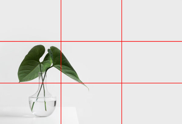
Balance refers to the visual distribution of weight in a design. Balance can be symmetrical, or it can be asymmetrical. Whichever choice you make, there should be an intent behind it. If you’re looking to achieve asymmetrical balance, start with the rule of thirds. This is typically applied to photographs (can be seen above), but can also be useful for web or print design when selecting a website layout. The rule of thirds states that an image should be divided into nine equal parts by two equally-spaced horizontal lines and two equally spaced vertical lines. The important elements should be placed along these lines or at their intersections. Symmetrical balance is exactly what it sounds like — if you can fold it in half and it’s the same on both sides, you’ve achieved symmetrical balance.
Utilize White Space
White space is a design element. It is not just blank space. White space is the simplest design principle you can utilize since it requires no extra work, just an ability to utilize the space given to you. White space also aids in the creation of hierarchy, a principle we discussed earlier. While design concepts like brutalism may be trending now, clean is classic and withstands the test of time. White space serves as a simple contrast tool against other elements on the page. It creates balance and ensures the design doesn’t get too overwhelming for users.
Repetition
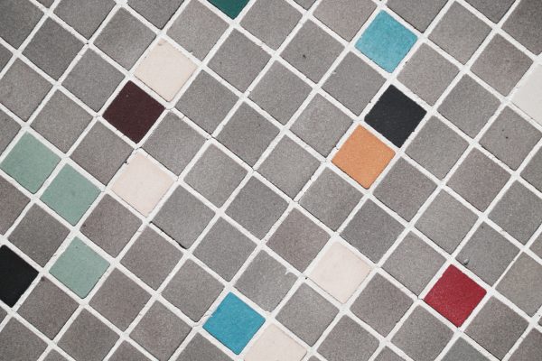
People are drawn to pattern and repeating elements. Some of the more famous pieces of artwork utilize this principle of design as well (think Andy Warhol). Repetition is one of the simpler design principles to utilize in print and digital pieces since it requires utilizing elements that have already been created. On a website, repetition can extend to the user experience with similarly designed pages. That makes the experience seamless for the user and aids in unity, which we will talk about next.
Unity
Arguably the most important element of design is unity. It is also the hardest to achieve. Whether it is a piece of art, a website, or a book cover, every element should relate to another ensuring that the design as a whole feels like one piece of work. Unity is hard to describe, but when you see it, you know it.
If you’re looking to create timeless, useful designs for your organization (print or online), contact Cabedge. We love working with clients that want to create streamlined design experiences for their clients. You’ll be contacted by a design specialist to find out your organization’s needs, and we’ll work with you every step of the way to make sure you’re getting what you need.

